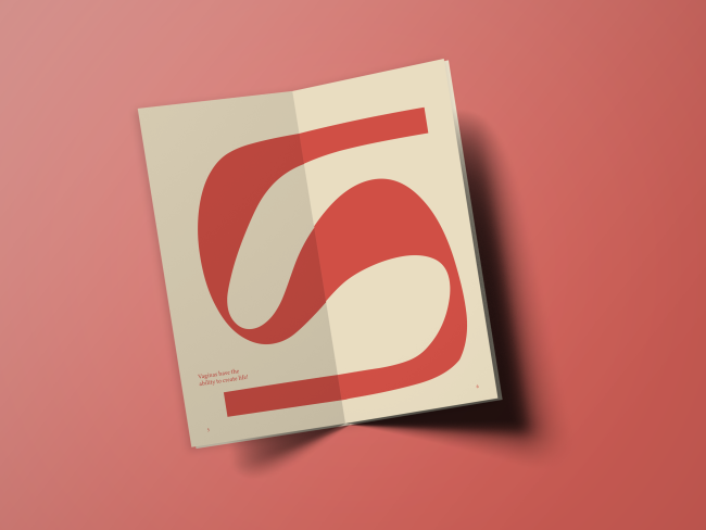
Bread and Butter
Maya Monis
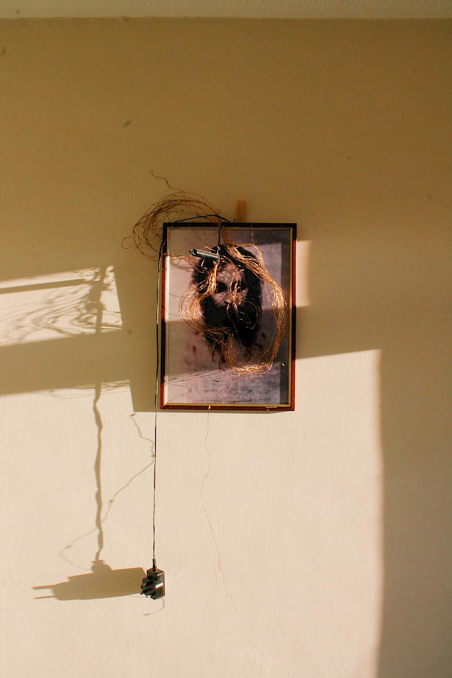
Bread and Butter
Maya Monis
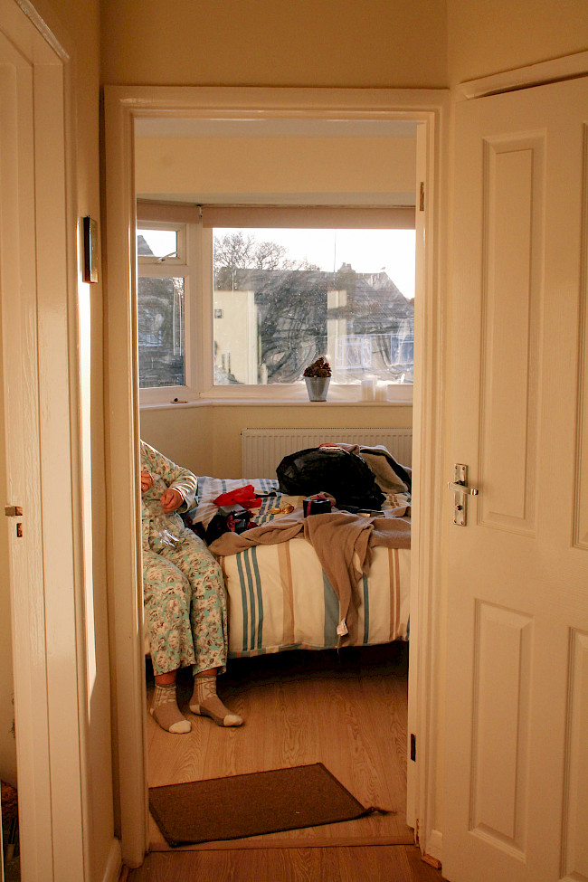
Bread and Butter
Maya Monis
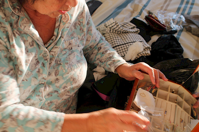
Bread and Butter
Maya Monis

The First Fifteen Lives of Harry August
Maya Monis
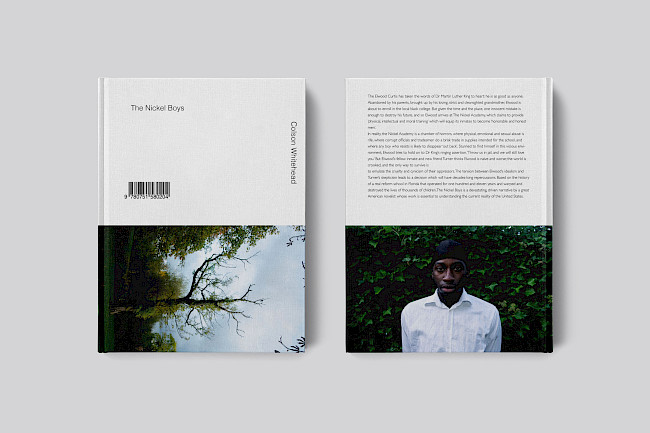
The Nickel Boys Book Cover
Maya Monis
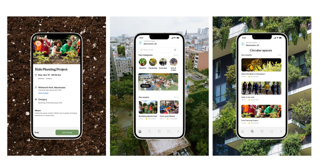
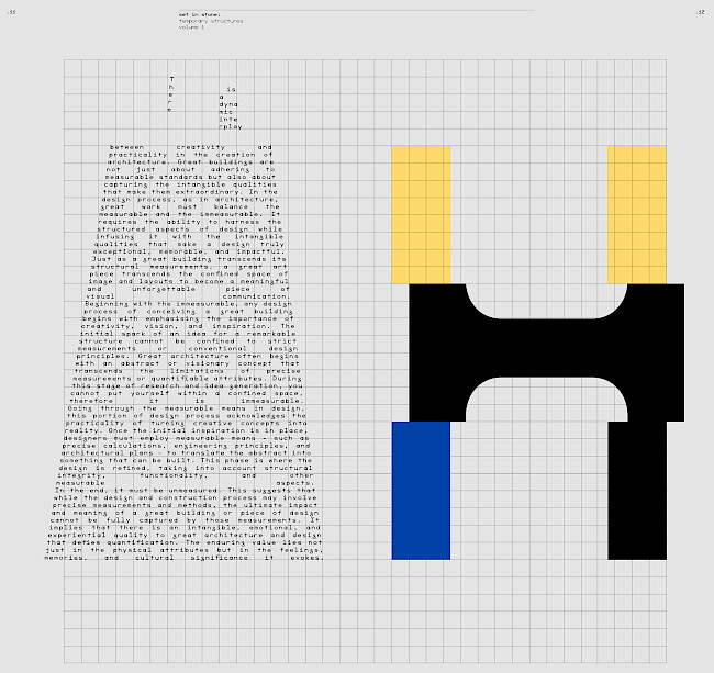
Circular Spaces
Maya Monis
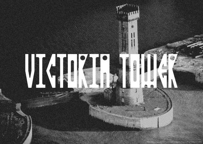
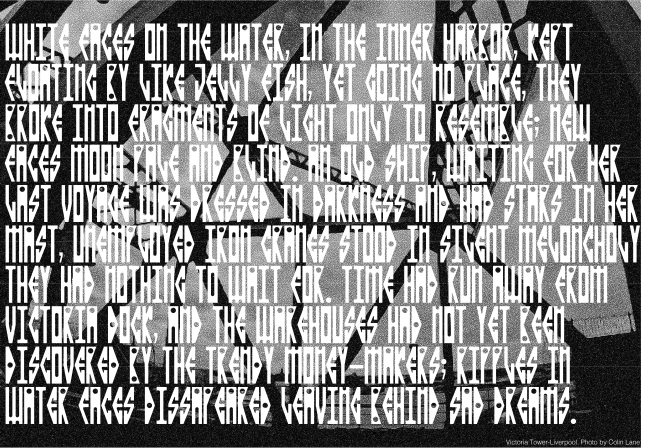
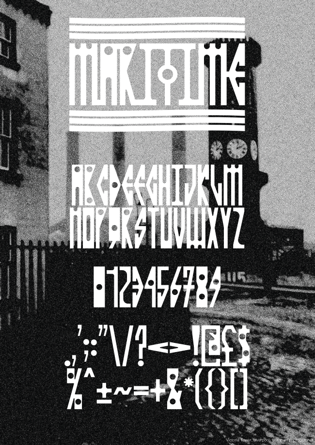
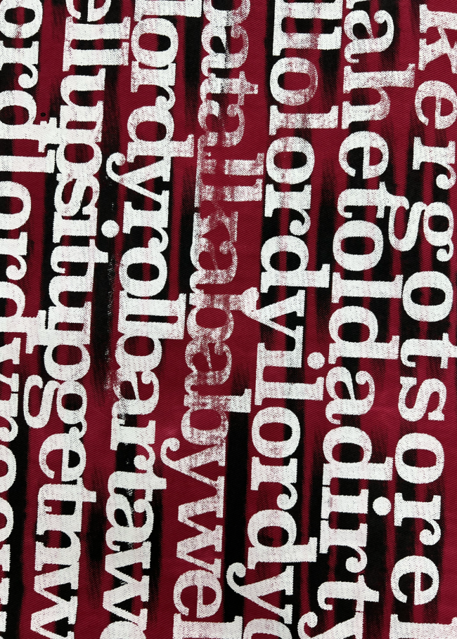
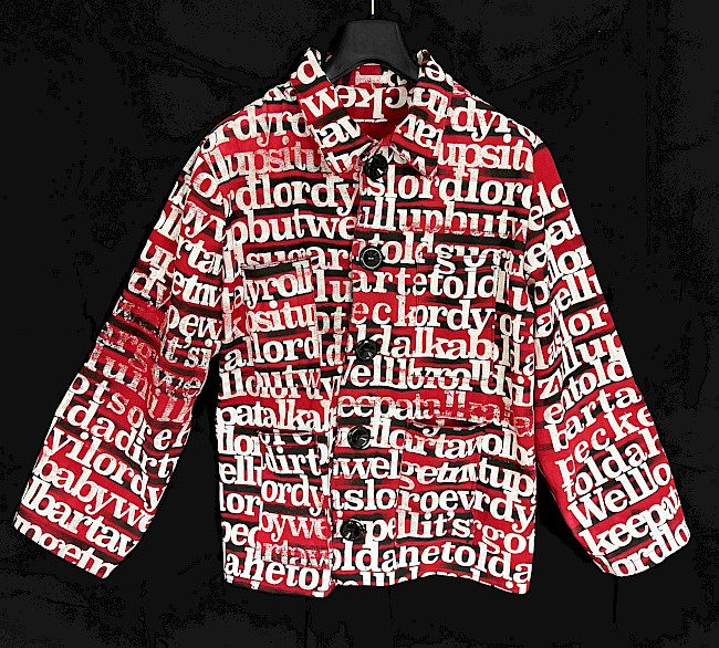
Maritime typeface
Aaron Moss
Maritime typeface
Aaron Moss
Maritime typeface
Aaron Moss

Life, death, and permanence
Aaron Moss
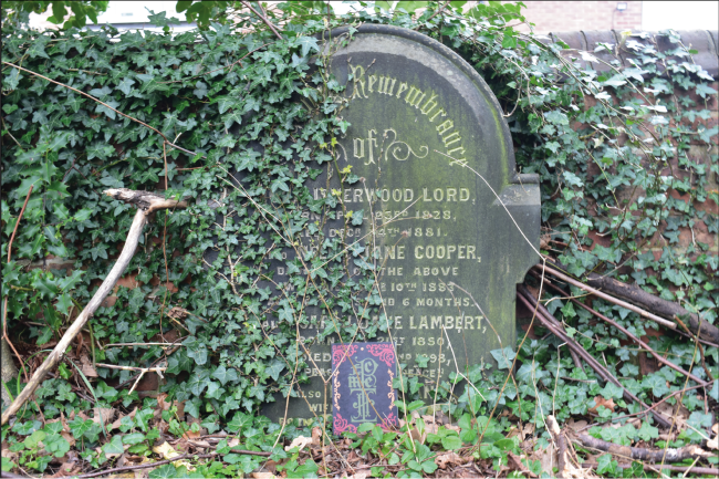
Life, death, and permanence
Aaron Moss
Life, death, and permanence
Aaron Moss
Hand-drawn illustrations
Aaron Moss
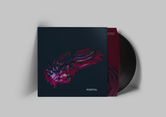
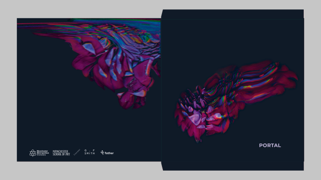
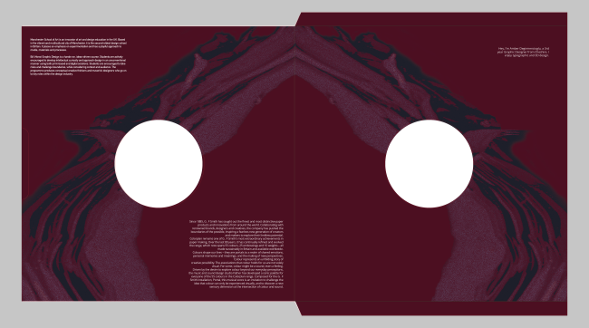
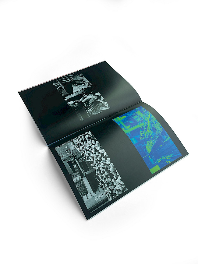
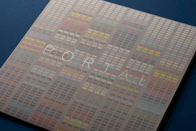
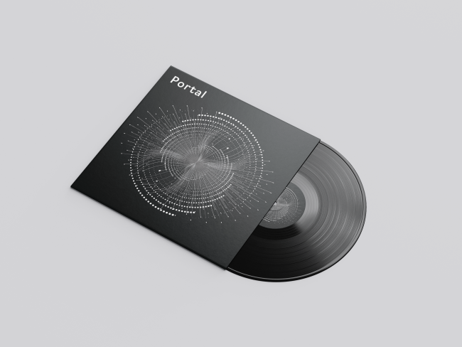
G.F Smith Portal
Aaron Moss
G.F Smith Portal
Aaron Moss
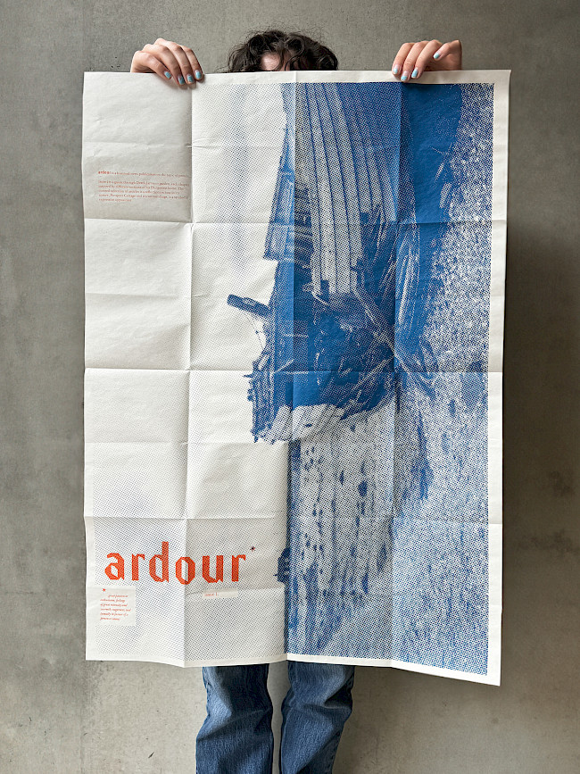
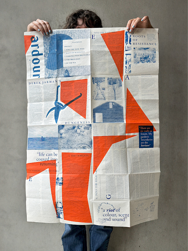
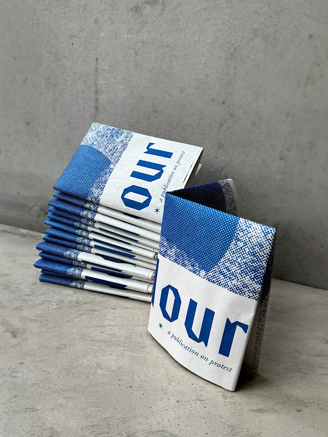
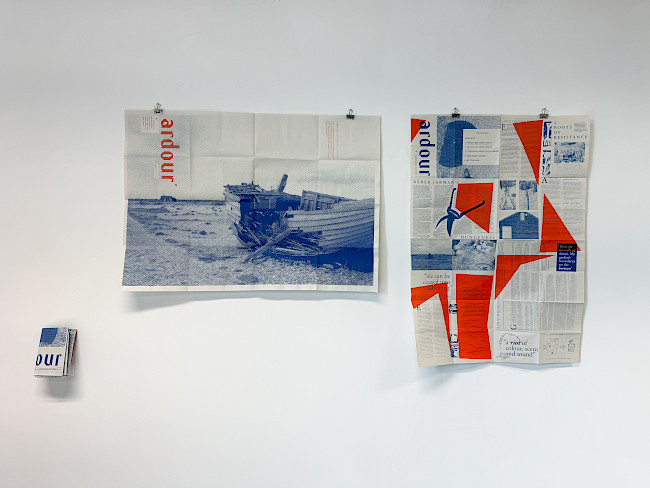
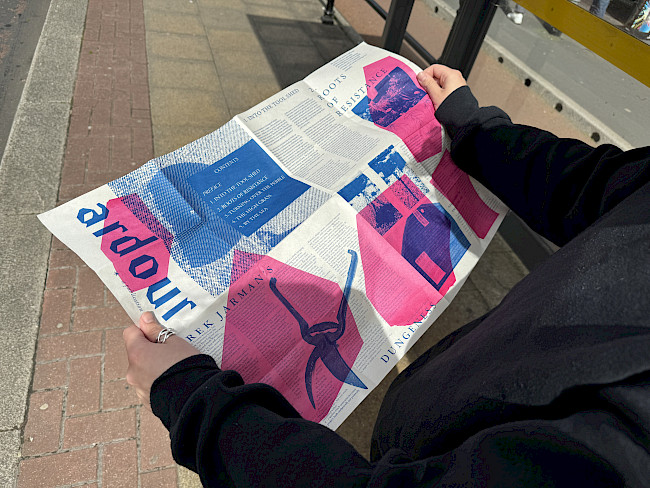
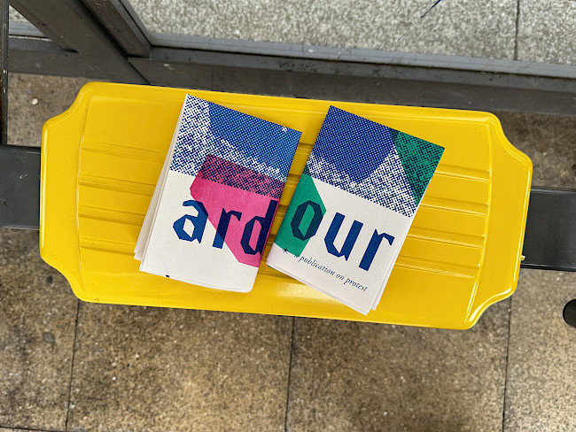
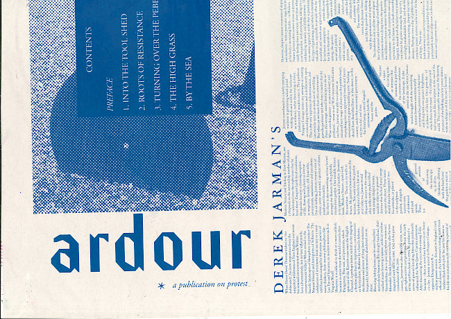
Ardour
Roxy Luke
Ardour
Roxy Luke
Ardour
Roxy Luke
Ardour
Roxy Luke

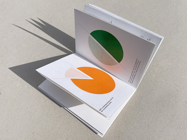
Afterthought
Roxy Luke
Afterthought
Roxy Luke
Afterthought
Roxy Luke
Afterthought
Roxy Luke
Ardour
Roxy Luke
Ardour
Roxy Luke
Ardour
Roxy Luke
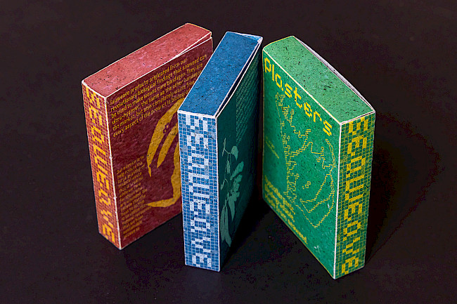
Seaweave
Roxy Luke
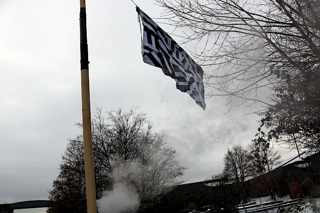
Flag for planet
Maurice Carter
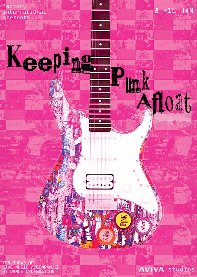
Brochure
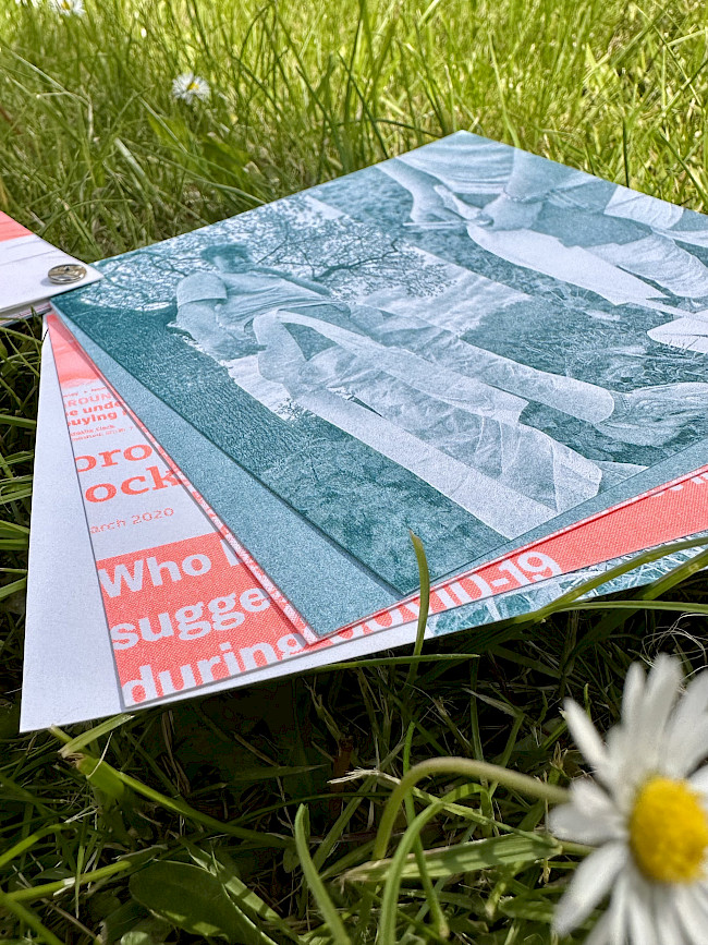
Maurice Carter
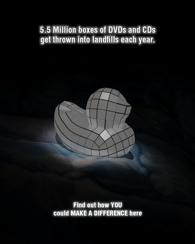
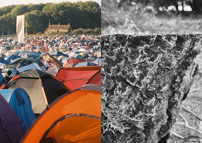
Landfill poster
Maurice Carter
Squared
Amber Degirmencioglu
Cherry
Amber Degirmencioglu
Voodoo Ray
Amber Degirmencioglu
G.F Smith Portal
Amber Degirmencioglu
G.F Smith Portal
Amber Degirmencioglu
G.F Smith Portal
Amber Degirmencioglu
When I Rise
Jude Wakeley
When I Rise
Jude Wakeley
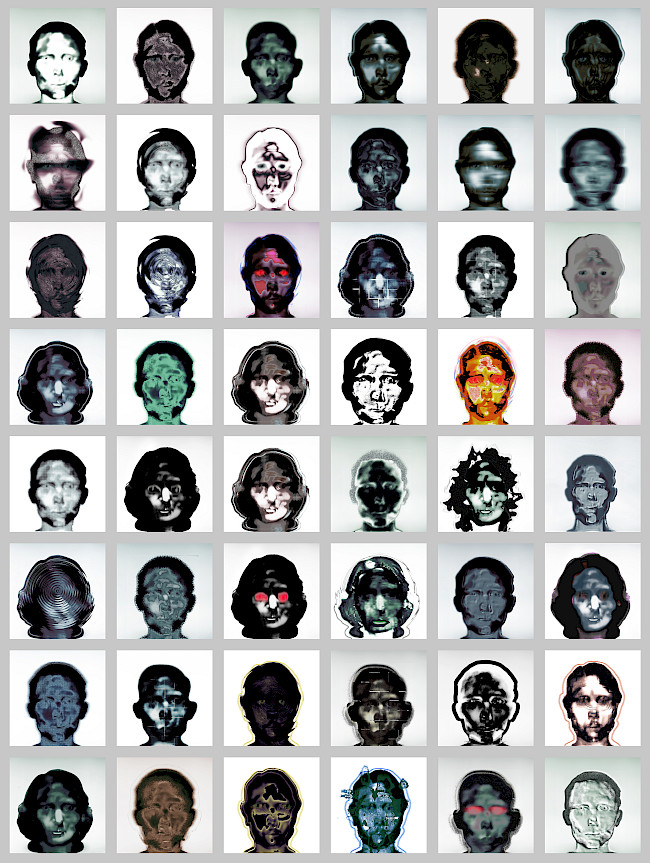
Faces
Jude Wakeley
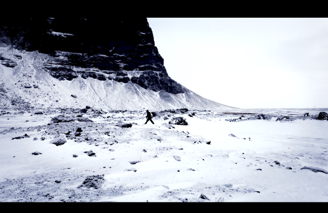
Penumbra
Jude Wakeley
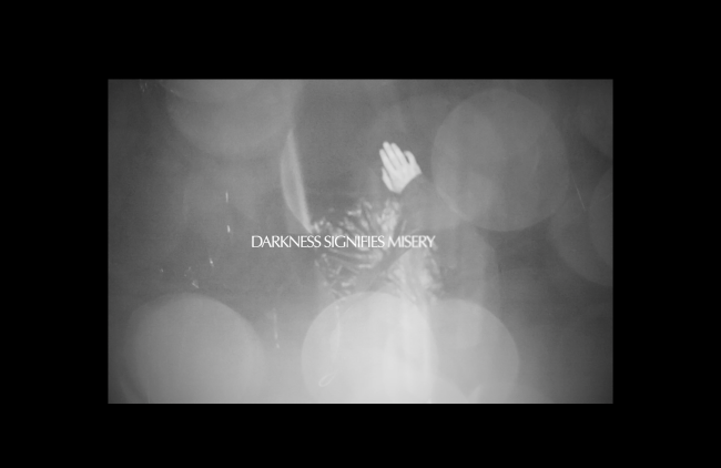
Penumbra
Jude Wakeley
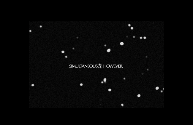
Penumbra
Jude Wakeley
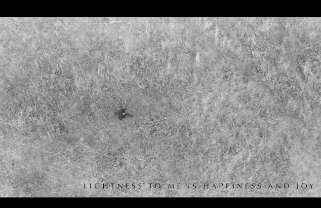
Penumbra
Jude Wakeley
Penumbra
Jude Wakeley
Doam
Igor Kijko
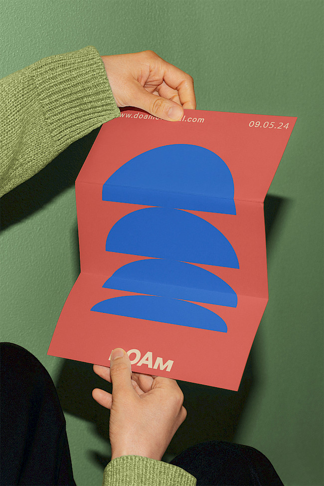
Doam
Igor Kijko
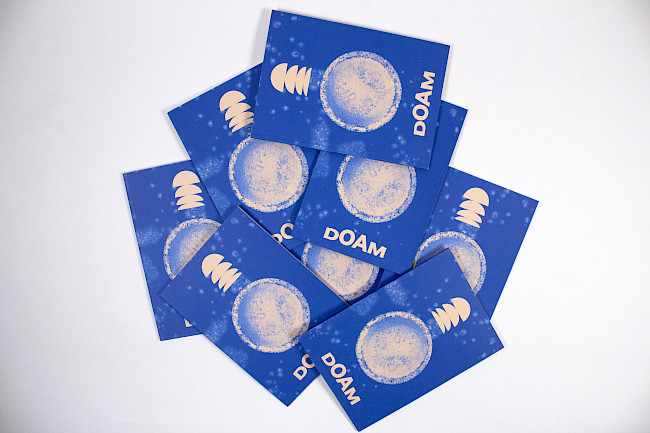
Doam
Igor Kijko
ISTD
Igor Kijko
ISTD
Igor Kijko
ISTD
Igor Kijko
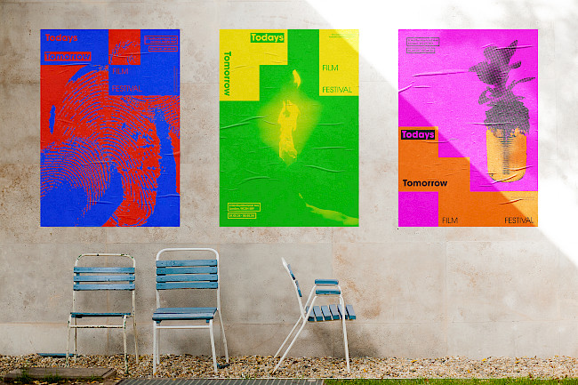
Todays Tomorrow Film Festival
Igor Kijko
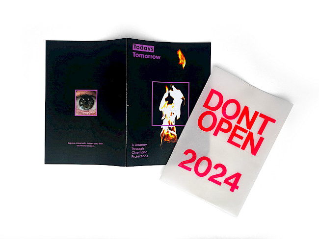
Todays Tomorrow Film Festival
Igor Kijko
Todays Tomorrow Film Festival
Igor Kijko
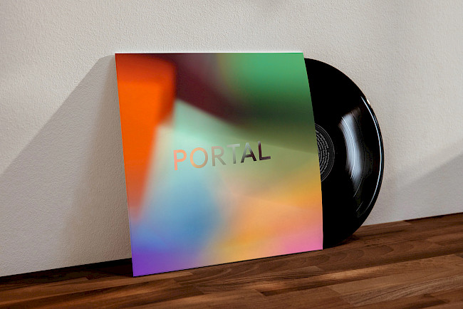
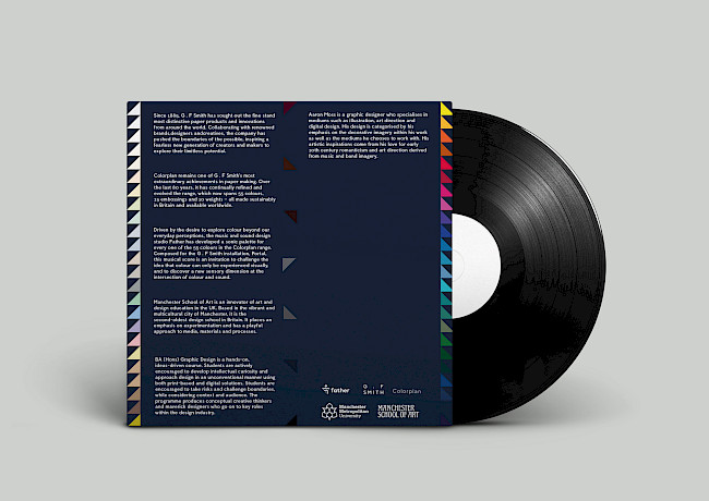
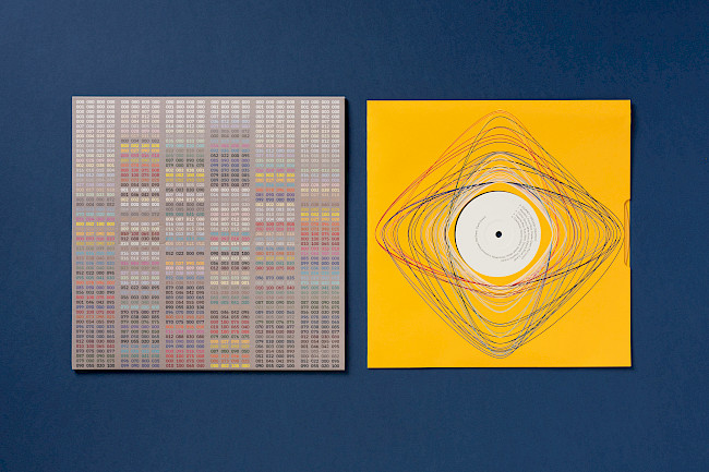
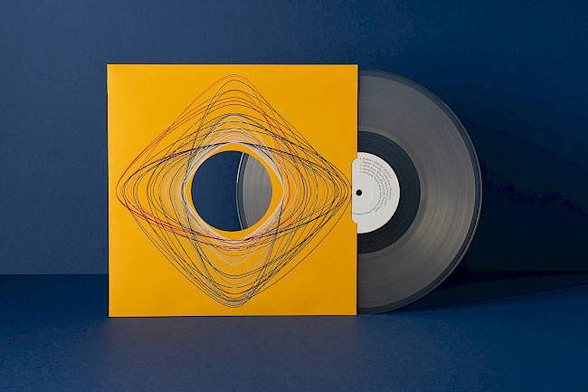
G. F Smith Portal Vinyl Cover
Igor Kijko
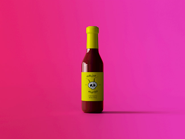
Macho Macha hot sauce
Erin Parkes
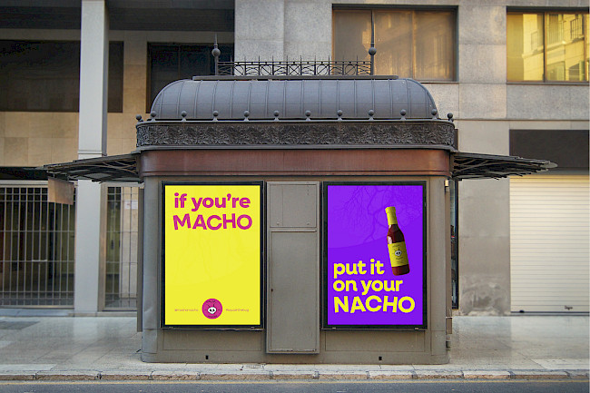
Macho Macha posters
Erin Parkes

Macho Macha branding
Erin Parkes
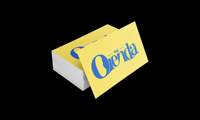
Orenda witch museum
Erin Parkes
G.F Smith Portal
Bradley Sansom
G.F Smith Portal
Bradley Sansom
G.F Smith Portal
Bradley Sansom
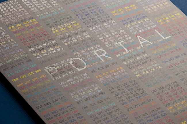
G.F Smith Portal
Bradley Sansom
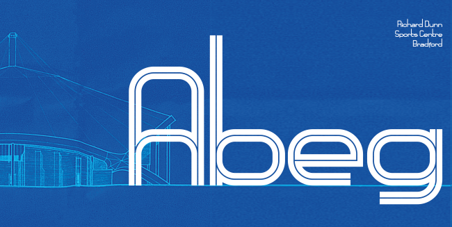
Richard Dunn typeface
Bradley Sansom
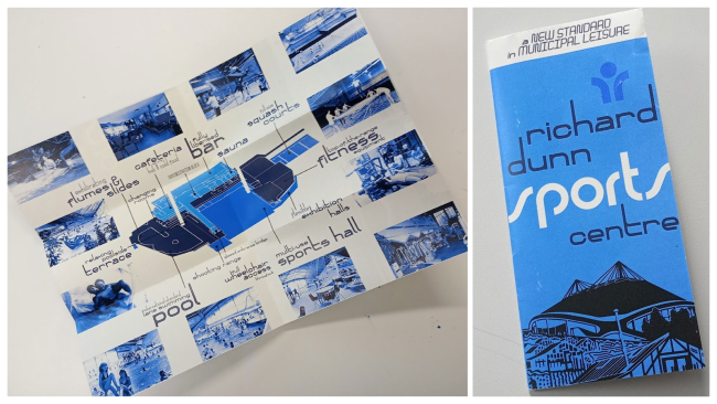
Richard Dunn typeface
Bradley Sansom
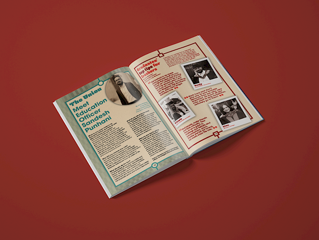
aAh! FRESHERS Issue
Bradley Sansom
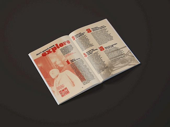
aAh! FRESHERS Issue
Bradley Sansom
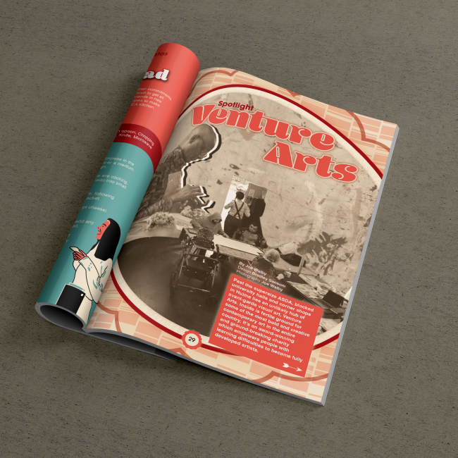
aAh! FRESHERS Issue
Bradley Sansom
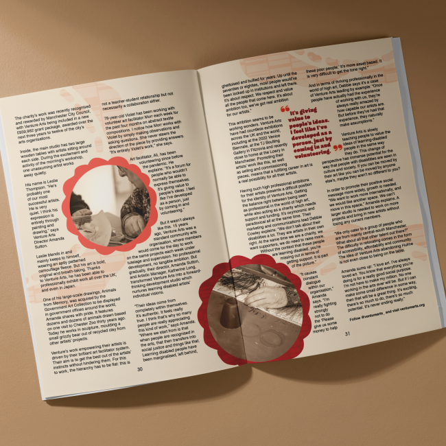
aAh! FRESHERS Issue
Bradley Sansom
Bradley Sansom
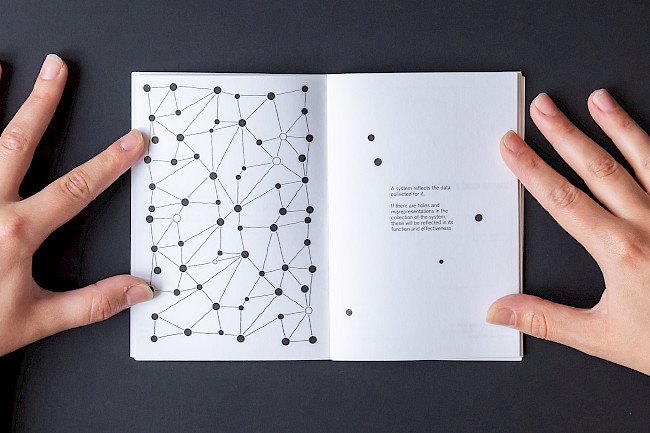
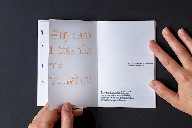
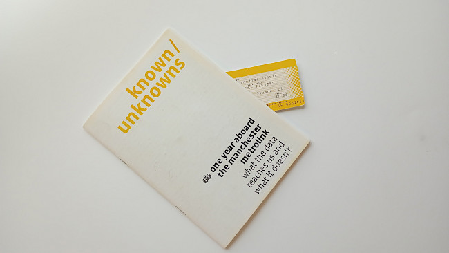
known/unknowns
Bradley Sansom
known/unknowns
Bradley Sansom
known/unknowns
Bradley Sansom
known/unknowns
Bradley Sansom
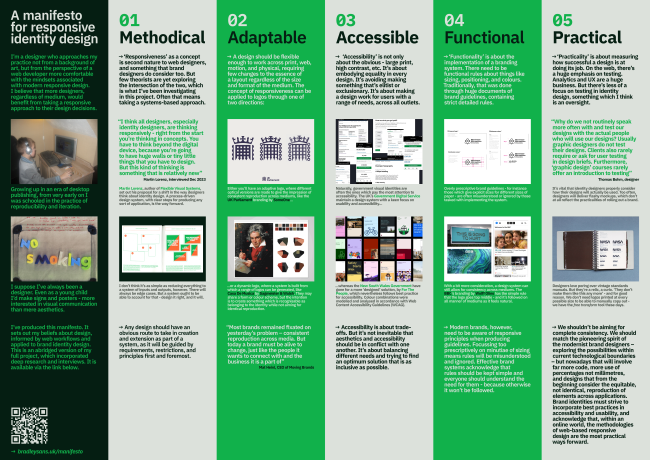
A manifesto for responsive identity design
Bradley Sansom
Bradley Sansom
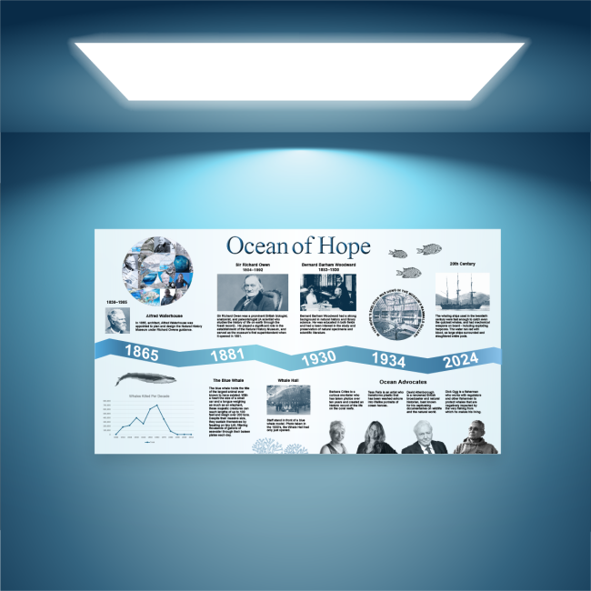
Ocean of Hope
Michelle Beaver
G.F Smith Portal
Michelle Beaver
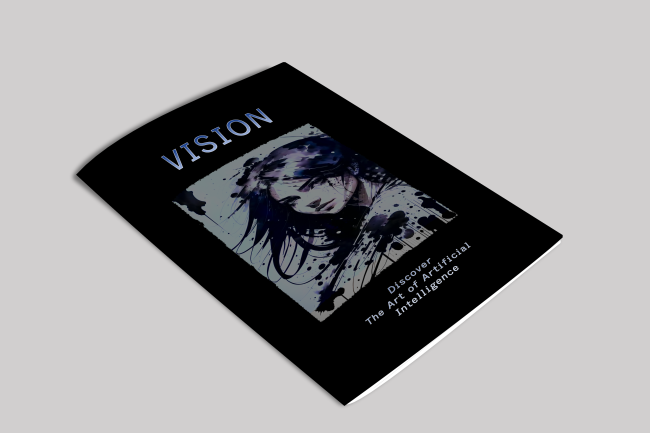
Vision magazine
Michelle Beaver